


 Email
Email SMS
SMS Whatsapp
 Web Push
 App Push
 Popups
 Channel A/B Testing
  Control groups Analysis
 Frequency Capping
 Funnel Analysis
 Cohort Analysis
 RFM Analysis
 Signup Forms
 Surveys
 NPS
NPS Landing pages personalization
  Website A/B Testing
  PWA/TWA
 Heatmaps
 Session Recording
 Wix
Wix Shopify
 Magento
 Woocommerce
 eCommerce D2C
  Mutual Funds
 Insurance
 Lending
  Recipes
  Product Updates
 App Marketplace
 Academy
Email footers are a great way to build a professional and well-branded look for your emails. Whether you utilize them on all outgoing communications or just certain important ones, a branded email footer helps introduce yourself and your company in the best light.
It’s also a useful way to promote your brand, products, and services since it’s visible with every mail sent out.
However, with so many ingenious options available when selecting an email footer design, it can be difficult to find the perfect one that captures the true essence of you and/or your business.
To simplify this process, we have rounded up 16 email footer examples from different industries worldwide. You’ll find something here that suits your company’s branding style.
Contents
16 Best Email Footer Examples
1. Elle Johnson Co.
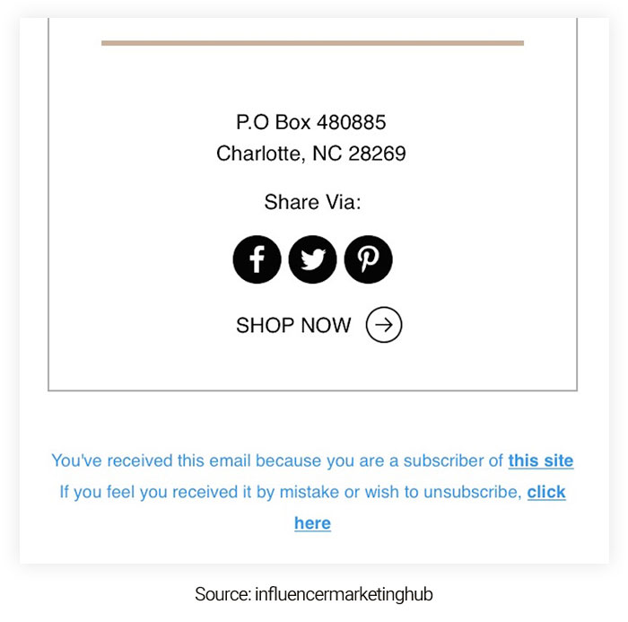
Elle Johnson Co has kept its email footer quite simple. This example focuses on getting readers to share their email marketing via social media. It is a great way to create buzz about your brand and utilize your current subscribers or customers to reach new ones. Then, they slip in a CTA, leading readers to shop.
2. Stacks
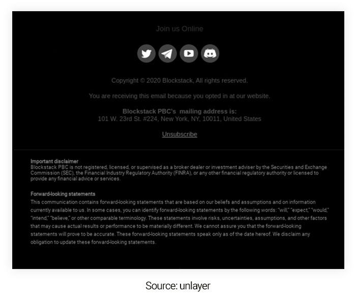
If you share sensitive information via email, you must incorporate a security disclaimer in your email footer. This will notify your recipients that the information they share with you is confidential.
It is one of the best email footer examples. Stacks has added a critical security disclaimer in the footer that tells their readers that Blockstack PBC is not licensed by the USA’s Security and Exchange Commission (SEC).
3. South Dakota

Adding social media links to your email footers improves your audience engagement. It encourages them to take action and pushes traffic to other channels.
Instagram, Facebook, Twitter, and other platforms are widely used, so why not tell your customers what your business offers there? You can get all their marketing posts and purchase by clicking the social media buttons of South Dakota.
4. Forever 21
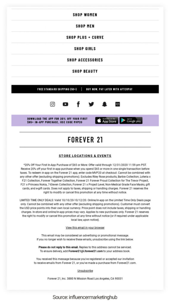
The Forever 21 email footer contains a lot of information, but it works. First, they’ve prompted shopping through helpful links that perform well for mobile users since spacing has been done effectively. Then, they add their shipping offer and payment options right underneath, where shoppers will notice them.
Under that, you can find well-spaced social media icons that make it easy for subscribers to follow the brand before allowing them to download the Forever 21 app and get a discount on an in-app purchase.
Ultimately, Forever 21 incorporates a link to their stores and events below all of that clicky goodness before offering the legal fine print for the offers they had in their email copy. Altogether, it’s one of our list’s busier email footer examples.
5. Goodreads
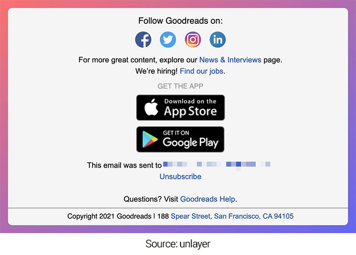
About 79% of smartphone users have bought online using their cell phones. Hence, Goodreads allowing its customers to download its mobile app from Google Play or iTunes appears logical by including a relevant link in your email footer.
This will be a huge opportunity to boost its mobile app and improve its downloads. It is another great email footer example as it promotes the downloading of mobile apps and encourages their subscribers to use them.
6. Shopify
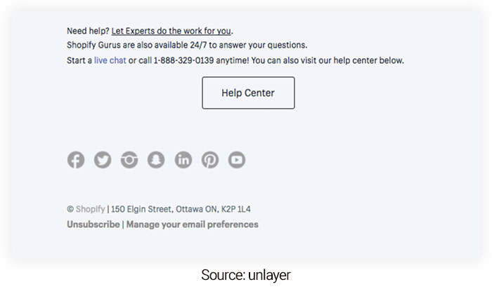
The emailing audience will likely have questions and could utilize some help with your services.
Therefore, offer a way for them to contact you in your email footer. Shopify leverages this opportunity and provides a direct link to their live chat or helps customers to reach their support team. This example shows how Shopify works proactively to satisfy its customers’ needs.
7. Netflix
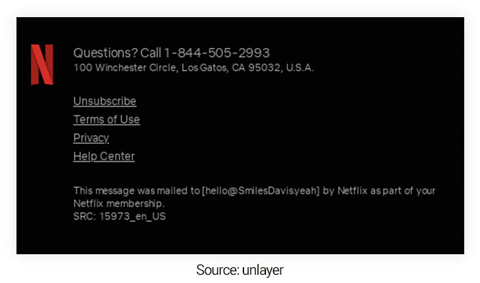
Roughly 61.9% of email campaigns are viewed on mobile. So having a mobile-friendly email template with an engaging footer makes sense. Modifying your email footer for mobile devices can greatly improve your conversion rate. Netflix ensures that its email templates and footers are optimized for desktops and mobile devices.
8. Babbel
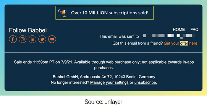
Babbel subtly indicates how their 10 million subscriptions have already been sold in the email footer. So if someone has reached your email footer, either they are looking for an unsubscribe button or are genuinely curious about your brand and want to know more.
So, it’s the perfect opportunity to incorporate social proof here to build trust and help your customers decide. You can showcase your company’s facts or add a happy client’s review to demonstrate your credibility.
9. Grammarly
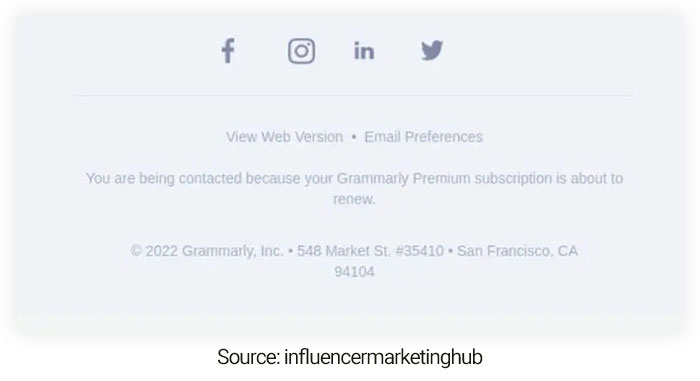
Grammarly keeps the simplicity with their email footer. They’ve comprised a way for subscribers to download the app in their email body, just above the footer.
The email footer is concentrated on propelling subscribers to follow Grammarly on social media using well-spaced icons and a stunning color scheme. Readers can then view the email via browser, adjust their email marketing preferences, or unsubscribe before entering the legal fine print.
10. Headspace

Headspace has taken a reassuring and professional route in its email footers. Here they deliver a way for subscribers to effortlessly reach out to them or discover answers to questions using the Headspace FAQ.
In addition, they let subscribers know they can talk to a real person during working hours (a huge plus to Headspace users who desire to deal with real people).
Beyond that, Headspace shows subscribers a way to connect with them on social media and links to the Headspace site, how it works, another link to the FAQs, and Terms and Conditions.
11. Local Eclectic
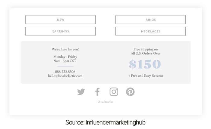
Local Eclectic includes a visually appealing, muted email footer that makes customers feel calm and soothed. They incorporate a few buttons for subscribers to shop with them and customer support details.
We love how they promote their free shipping threshold using a distinct color for the amount. The assurance of “free and easy returns” is also excellent.
12. Pineapple Collaborative

Growing your email list takes time, effort, and energy. But it is always best to admire your recipients’ freedom of choice and let them decide whether or not they want to receive your emails.
Because barely engaging your customers with your content isn’t worth your time and energy. Plus, you don’t like your emails to be flagged as spam and risk your IP address from getting blocked.
So, offering them the option to unsubscribe is best for more useful email engagement and conversion rates.
Similarly, you can include a link to allow users to manage their email preferences to improve engagement and prevent emails from landing in the spam folder.
13. Codecademy

This Codeacademy email footer example uses a footer to comply with anti-spam government regulations by incorporating information like your company’s registered office address, privacy policy, terms and conditions, and copyrights.
The more details you give subscribers, the more likely they’ll trust your company and continue receiving your emails.
14. Hestan Culinary
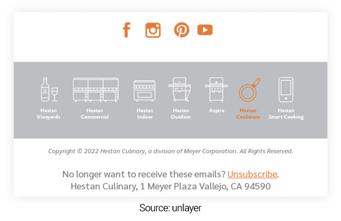
Attention to detail is important in email design. Therefore, make sure you align your email footer with your brand’s style and identity.
Your users will be surprised that you’ve given close attention to the little details in your email footer and will remember your brand for a long time.
15. Postable

Postable included a link in its email footer asking recipients to add their email to their address book. In this example, asking users to whitelist their email address help Postable avoid spam filters and blockers.
This way, you will filter your email list further by asking them to add your email address to their address book.
Doing this will ensure your email will be received and improve your open rate since they have preferred you again.
16. Monica Vinader
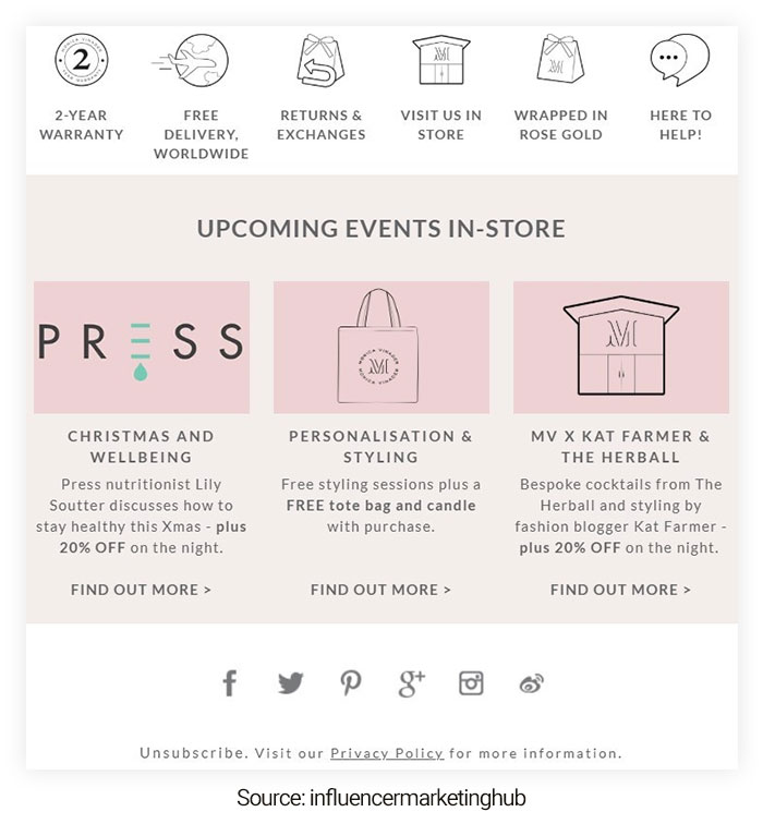
Monica Vinader is one of the best email footer examples, with more information and design than you usually see here. We love the icons at the top of the footer. They share more details about the brand, its values, and how to shop before entering the store’s upcoming events.
Conclusion
As you can see from the email footer examples above, there are many creative and effective ways to set up your footer. Not only should this section of your emails contain essential info like contact details or legal disclaimers, but you should also ensure it’s designed neatly.
This is particularly true if you’re part of an organization with many brand guidelines—you like your email footer design to match that. Now don’t be shy about showing off what you’ve learned! Feel free to add in social media links.
Remember that however you determine to put together your email footer, be strategic and informative. And most importantly, have fun testing with the wide range of options available and make it yours!
Also Read:

