


 Email
Email SMS
SMS Whatsapp
 Web Push
 App Push
 Popups
 Channel A/B Testing
  Control groups Analysis
 Frequency Capping
 Funnel Analysis
 Cohort Analysis
 RFM Analysis
 Signup Forms
 Surveys
 NPS
NPS Landing pages personalization
  Website A/B Testing
  PWA/TWA
 Heatmaps
 Session Recording
 Wix
Wix Shopify
 Magento
 Woocommerce
 eCommerce D2C
  Mutual Funds
 Insurance
 Lending
  Recipes
  Product Updates
 App Marketplace
 Academy
Contents
What is a Call-to-Action Button?
Call-to-action (CTA) buttons are those buttons that you can apply on your website and on your landing pages to lead users towards your goal conversion. It’s a part of the landing page that the user has to click to take the action you need them to take.
CTA buttons can differ in style and size depending upon your goal conversion and website style. Some of the common instances of call-to-action buttons are:
- Download buttons
- Free trial sign-up buttons
- Add to cart buttons
CTA buttons have a specific goal: to make your web visitor click and to complete a conversion.
How Does a Cta Urge Someone to Click?
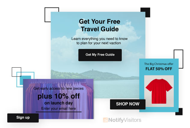
Email call to action generally employ bright colors and thoughtful placement, but the best ones use specific, actionable verbiage to draw attention. A few examples:
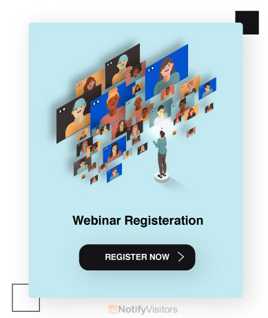
- Register now
- Start my trial
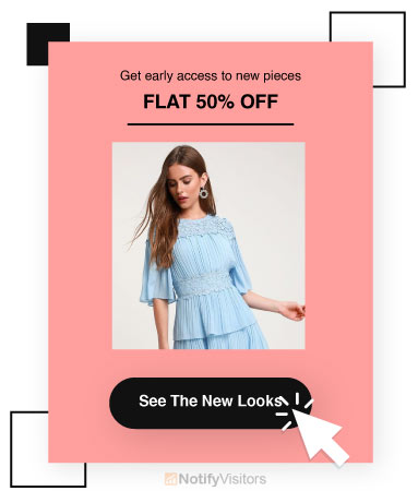
- See the new looks
- Take 50% off
Why Should I Utilize a CTA Button?

Buttons are quite eye-catching and clean, making them an easy way to increase conversions. According to a study, a button-based CTA raised the click-through rate by 28% over a link-based CTA. Now, it’s time to discuss different call-to-action button’s best practices to help you get a higher CTR.
17 Best Practices to Optimize Call to Action Buttons for Better Conversions
1. The Colors Duke, The Colors
Your button color matters a lot. It is an important thing that you should keep in mind that you should give thoughtful consideration to your button colors. Usually speaking, green and orange buttons are proclaimed to perform best.
But, eventually, it will also depend on your site design, as contrasting colors work best to make attractive buttons stand out. For instance, you wouldn’t require a green CTA button on a green background.
If you’re still not convinced what looks best, then go for the super-advanced squint test and see what comes off most appealing. But, if you really want to understand what color CTA button will go best on your page, testing is the only way to find out.
2. Large and Legible Text
Make sure that your button text should be large enough to understand easily but not so big that it looks displeasing or intimidating.
While it may appear silly to suggest that large text makes people feel uneasy or uncomfortable, many users do experience subconscious distaste for threateningly large lettering.
Therefore, your button text should be big enough to attract attention but not so big that it simply overwhelms the rest of the content.
3. Use Action-Packed Text
Email Call to action buttons should highlight striking, action-oriented text. Replace boring words like “submit” and “enter” for more action-packed words such as “get,” “reserve,” and “try”. Your action words should go along with particular text relating to your offer like:
- Try Our Free Trial
- Download Whitepaper
- Reserve Your Seat
4. Snazzy Button Shapes

Button shape also plays a significant role when trying to craft the ideal CTA button. You’ll have to consider whether you desire to go with a more rounded button shape or a button with square edges.
It becomes difficult to say what acts better here as both styles are common, and both can work well in different settings.
Eventually, you’ll need to test shapes and see what works best for your biz! But as per ContentVerve’s test, a rounded green button performs better than a blue rectangle.
5. Go With 1st Person Speech
According to a study, adjusting button text from the second person (“get your free template”) to the first person (“get my free template”) leads to a 90% increase. See how transforming your CTA button to 1st person (putting yourself in your customer’s shoes) influences your CTRs.
6. Create a Sense Of Urgency
Creating a sense of urgency in your email call to action buttons can generate some impressive click-through rates. For instance, you could use button text like:
- Download the Build Apps E-Course for $30- $10!
- Sign Up and Get 50% Off Today Only!
Even just attaching “now” creates a subtly sense of urgency for users:
7. Button Text Shouldn’t Go On and On and On.
It’s good to apply specific action-oriented button text. Considering that, it may be fascinating to stretch out your button text, but that’d be a bad move. Ideally, you’ll have to keep that button text to two or five words.
If you want the perfect display ad call-to-action to send users to your landing page, try Smart Ads Creator, which generates designer-quality display ads furnished with call-to-actions that are hand-tailored to your business.
8. Get Fancy With Button Graphics
In some cases, tiny arrows or graphics on your CTA button can undoubtedly affect click-through rates. If you’re going to apply graphics, make sure that your icons explain rather than confuse the offer for users.
For instance, you would desire to avoid using a disk download icon for a user who is registering for a webinar.
9. Bonus Button Text

There are some situations in call-to-action marketing where you may need to consider adding an additional line of information within your button text.
This practice is popular with free trial buttons. For instance, a free trial button might state “30-day trial, no credit card” in smaller text beneath the main “Start Your Free Trial” button text. This is important info that will prompt users to click through to start their trial.
This won’t always be required with all buttons, but this additional information can help CTRs a lot when it suits.
Alternatively, you can put that more information underneath or beside a button. According to Copyblogger, these elements are known as “click triggers.” Some cases of click triggers include:
- Key Benefits
- Testimonials
- Anxiety-Suppressing Info (e.g., No credit card required)
- Data Points (e.g., users see a 40% increase in shares when using X)
10. Keep it Above the Fold
You always need to keep your email call to action button above the fold so that users never avoid it. Make sure that the important information should always be kept above the fold.
The further extra info should stay below the fold, where it continues to be accessible but not distracting.
11. Less is Better When it Comes to Choices
Humans tend to experience the choice paradox – we enjoy picking between an apple or an orange, but present us with apples, oranges, dragon fruit, grapes, pomegranates, bananas, clementine, and mangos our heads may almost explode with indecision.
According to a study by Mark Lepper of Columbia University, participants who were invited to choose one chocolate from a box of six were more satisfied with their selection than participants who selected one chocolate box of 30.
So keep your users satisfied by giving them fewer buttons to pick from.
If you do desire to incorporate multiple button choices, give importance to one choice over others to support funnel users towards a particular path. It doesn’t even matter what path really – users are just required to be guided!
12. Natural Hierarchy
Sometimes you’ll own other buttons on your web page that are not your chief call-to-action conversion buttons. Those buttons should be less attention-grabbing than your main email call to action button.
For your non-CTA buttons, try using grayscale buttons or monochromatic colors. But, of course, your main call-to-action button should always be the largest and brightest.
13 Use Button Copy for Value Proposition.
You may see that many buttons incorporate the word “free,” as in, “Get My Free Ebook.” “Free” is an enticing word, and applying that word in button copy highlights your offer’s value proposition.
Analyze your offer’s value proposition and how it might best be presented in your call-to-action button.
14. Cart Call-To-Actions
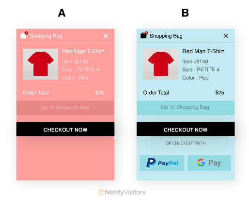
E-commerce sites will need to consume the most time A/B testing their cart/purchase buttons. Even small changes in cart buttons can dramatically influence conversion rates. Make sure you offer buttons for other payment options like PayPal.
Providing a PayPal button can be a large incentive – there have been many times buying food where we have been too lethargic to fish out a credit card and only move forward by the grace of PayPal.
15. Follow the Natural User Flow
If we talk about Western culture, we see top to down and left to right. Keeping this original reading flow in mind can better influence smart button placement. For instance, call-to-action buttons located towards the bottom or to the right of content often exceed alternative placements.
Most importantly, never overpower users to backtrack to click a button – CTA buttons should be located at unsuitable places that align with a user’s experience.
For instance, you would need to put a “sign up now“ button in a spot where a user would see it after reading about your offer or product, not before, as it would make no sense for a user to sign up for an offer they understand nothing about!
16. Test Buttons Like Your Life Depends On It
Testing with email call to action buttons is utterly vital! If you haven’t done much A/B testing before, the call-to-action buttons are an excellent place to start as even minute, easy-to-make changes can produce dramatic effects. Test placement, colour, style, text – if you can think of it, you should test it!
17. Widen That White Space

Finally, your email call to action buttons should always own a healthy chunk of white space encompassing them. White space supports call the users’ attention to your button and helps it stand out.

