


 Email
Email SMS
SMS Whatsapp
 Web Push
 App Push
 Popups
 Channel A/B Testing
  Control groups Analysis
 Frequency Capping
 Funnel Analysis
 Cohort Analysis
 RFM Analysis
 Signup Forms
 Surveys
 NPS
NPS Landing pages personalization
  Website A/B Testing
  PWA/TWA
 Heatmaps
 Session Recording
 Wix
Wix Shopify
 Magento
 Woocommerce
 eCommerce D2C
  Mutual Funds
 Insurance
 Lending
  Recipes
  Product Updates
 App Marketplace
 Academy
You’ve likely experienced it before: after loading up a website, adding items to your cart, and getting ready to check out… you get distracted.
Later that day or the next morning, you may receive an email from the online retailer reminding you of what was left in your cart! What may have seemed like a gentle nudge to complete your purchase is an automated marketing tactic known as browse abandonment emails.
If you’re looking for ways to use this effective technology today, we’ve got some great examples and tips for creating successful campaigns – read on to learn more about browse abandonment emails and how they can increase sales for your business.
Contents
What are Browse Abandonment Emails?
Browser abandonment emails are a great way for businesses to try and get customers to finish their purchases. These emails remind customers who have added items to their online shopping cart yet have not completed the checkout process. They often prompt customers with useful marketing messages that explain the benefits of completing their order.
Businesses can design these emails to entice customers to return by providing discount codes or reminding them what item they had already placed in their cart. Many businesses use this email campaign as it is an effective technique that increases sales and website traffic.
9 best browse abandonment emails examples
1. Timberland
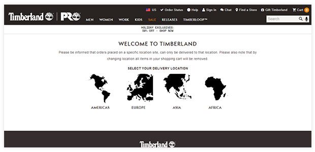
This is a typical but well-executed browse abandonment email from Timberland.
Timberland is a typical example because it contains all the major elements browse abandonment emails typically contain:
- An image of the exact product abandoned.
- A link to add it to your cart.
- Product recommendations in case the original product isn’t suitable.
These three elements are a fantastic starting point if you’re struggling to consider what to incorporate in your emails.
Beyond that, Timberland’s email is a great example, as it’s been executed well with high-quality product imagery and a simple, neat email design.
2. Smartwool
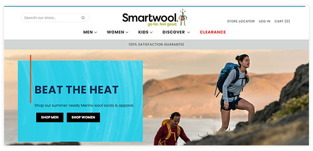
This example from Smartwool doesn’t even look like a browser abandonment email at first glance. The heading “Stop Searching. Start Exploring” gives this email away and makes it a great example of a browse abandonment strategy.
This is because instead of being like, “we saw you viewed this product, now come back and purchase it”, Smartwool is being much more modest. From the customer’s perspective, this would likely seem like a well-timed email and nothing more.
3. Humanscale
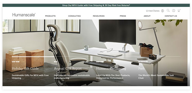
Humanscale is another example of a lovely and clean browse abandonment email design.
Like Timberland’s campaign, this one also contains high-quality product images and some product recommendations.
However, this example takes a step back instead of prompting the potential customer to add the products to their cart and checkout.
They do this by asking if the customer requires any help deciding and then letting them know they can call or email through any queries they may have. This symbolizes a more light-touch approach that avoids the email being too pushy.
4. Asos
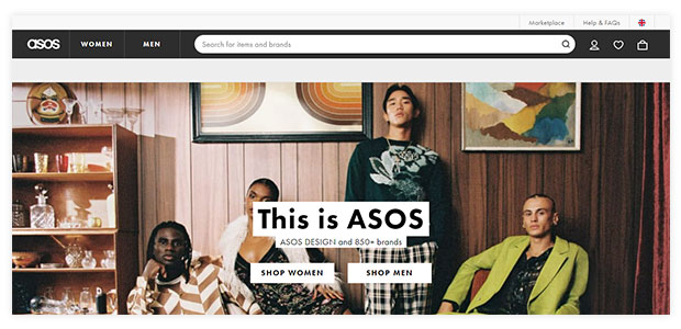
Instead of prompting customers to come back and buy the product they were viewing or even ask whether the customer had any questions, Asos’ email simply facilitates people to have a second look. Often this subtle suggestion can be sufficient to trigger a sale and surely won’t come across as too pushy. It’s all about keeping your brand, especially your products, front of mind.
5. Amour Vert
Another simple and beautifully planned browse abandonment email. This one from Amour Vert compliments the browse abandoner by stating they have great taste. Flattering customers like this is a common strategy brand will use in their browse abandonment emails.
The only problem with this particular example is that the product recommendations at the end bear little in common with the abandoned product.
6. Aerosoles
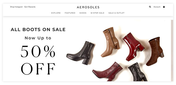
This example from Aerosoles combines a browse abandonment email and a sale email. This two-pronged approach is sure to make this email quite enticing. Including a sale, the offer will help improve the conversion rate of your browse abandonment campaigns. But that doesn’t mean you necessarily need to include one.
Typically you’ll want to send two browse abandonment emails: one straight after someone abandons the product and another roughly a day later if the first one didn’t work.
To avoid giving away too much margin, a good idea is to keep any offers to only this follow-up email.
7. Loeffler Randall

Another simple and clean email design, this browse abandonment example from Loeffler Randall, is well and truly on-brand. In addition to including the specific product their customer was looking at, they’ve also included links to product collections.
This works similarly to including personalized product recommendations by providing more options to choose from in case the original product isn’t suitable. Something you can consider doing as well.
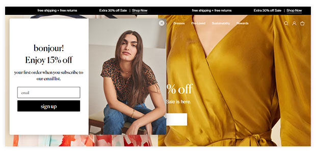
8. Michael Stars
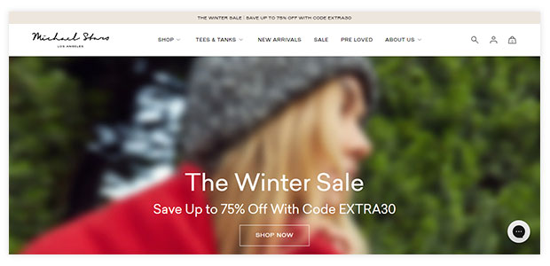
This browse abandonment email example from Michael Stars uses people’s fear of missing out (or FOMO) with a copy such as “Get it before it’s gone”. This strategy is worth experimenting with in your campaigns to notice whether it can enhance your conversion rate.
The other important thing about this example is how the call-to-action (CTA) button is ‘add to cart’ rather than ‘shop now’ or ‘view product’.
By clicking individuals to a shopping cart with the product already added, you reduce the number of steps required to purchase than if you simply linked them to the product page. This is another way you can enhance your conversion rate.
9. Danner
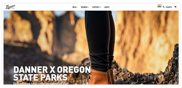
This example from Danner does not attempt to conceal the fact that it’s a browse abandonment email, but it does take a slightly different approach by adding an offer.
While the offer is quite hard to see in the body of the email, the heading “You’ve earned it” prompts customers to treat themselves. The offer then gives them a way to easily justify the purchase.
There is also a link at the bottom where potential buyers can “talk with a Danner expert” if they have any questions holding them back from making a purchase.
Conclusion
Browse Abandonment Emails are a fantastic way to recapture lost sales and boost your online revenue. By targeting customers who have shown an interest in your product but didn’t make a purchase, you can give them that extra push they need to buy.
And, with the right browse abandonment email strategy, you can dramatically increase your online sales.
If you’re unsure how to get started, we’ve put together nine of the best Browse Abandonment Email examples and tips from some of the world’s top eCommerce brands. So what are you waiting for? Get started today!
NotifyVisitors offers email marketing software that helps you recover lost sales by launching abandoned cart campaigns for your customers. To know more about our product, schedule a free demo.
Also Read:

