


 Email
Email SMS
SMS Whatsapp
 Web Push
 App Push
 Popups
 Channel A/B Testing
  Control groups Analysis
 Frequency Capping
 Funnel Analysis
 Cohort Analysis
 RFM Analysis
 Signup Forms
 Surveys
 NPS
NPS Landing pages personalization
  Website A/B Testing
  PWA/TWA
 Heatmaps
 Session Recording
 Wix
Wix Shopify
 Magento
 Woocommerce
 eCommerce D2C
  Mutual Funds
 Insurance
 Lending
  Recipes
  Product Updates
 App Marketplace
 Academy
A study by SalesForce, an American cloud-based software, states that firms that are great at nurturing leads bring in 50% more sales-ready leads at 33% lower price. Lead generation forms, also known as web forms, lead gen forms, or lead forms, are forms placed on your landing pages to turn your visitors into leads.
You need to create a lead form that your visitors find difficult to resist. We have searched the web to find 12 best-performing examples of lead generation forms.
We also tell you why they are successful at bringing in leads so that you can derive some inspiration from them.
Contents
12 Best Lead Generation Form Examples
1. Offer value
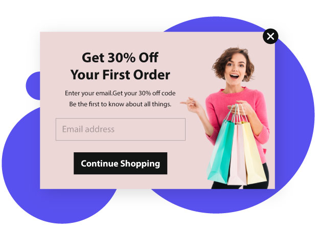
Your users should get some value from providing you with their details. Your offer should motivate them enough. For this, you have to have them in the first place. One great way to do this is to convey the benefits of filling up or using your form.
For instance, consider the above lead form by Unico Nutrition, a nutrition supplement company. It tells you that by filling up the form, you, as their first-time shopper, will receive an exclusive discount.
Pay attention to the crisp, clear, and bold wordings on it. That’s how your sentences on your form have to be to attract leads.
2. Make them feel secure

When you ask your visitors to fill a form for your firm, they may feel a little vulnerable if they are not familiar with you. They may wonder as to what you are going to do with their personal information.
You can relieve them of these concerns by including a link to your privacy policy on the form.
In the above image, you can see a lead form of Vtiger, a leading Cloud CRM solution. You can see how it includes links to its Privacy Policy and Terms of Service.
So, those who are unaccustomed to the firm can get to know about its privacy policy before they provide information about themselves to it.
3. Include freebies

Humans are naturally attracted to things offered for free.
You can give away freebies like an e-book, a trial of your services, a checklist, an online class, a software download, a training video, a template, a coupon, or something else in return for filling out your form.
Apart from generating leads, this can also earn attention for your brand and foster relationships with your visitors.
Freebies play on the rule of reciprocity. That is, when someone offers something nice to you, you feel the urge to do something nice to them in return”. So, do incorporate some kind of freebie into your lead form.
4. Have a strong CTA

You need a Call to Action (CTA) in your lead forms. It can be something like “download now”, “send me the checklist”, “subscribe”, “learn more”, “read more”, “book now”, “click here”, “watch now”, etc. to encourage your visitors to take an action.
A strong CTA is clear and crisp and compels your visitor to act favourably.
The design of your lead form’s CTA is as important as its copy. CTAs of different shapes, colors, and sizes work for different industries.
So, do some homework to know what works in your field.
5. Create urgency
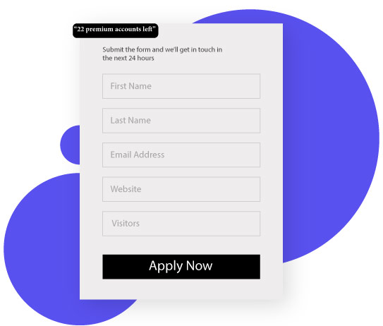
Yes, you heard it right. Just as you can create urgency in your e-commerce site, you can do so with your lead forms too! For instance, look at the below given lead generation form.
On the top of the form, you can find a small box that reads “22 premium accounts left”. This would urge the visitor to sign up to become one of the holders of the limitedly available accounts.
Another way to create urgency is by including a countdown timer in your lead form. The ticking down the clock tells your visitors that time is running out and the offer would end soon. So, they tend to turn in instantly.
6. Gamify it
Gamification of lead forms motivates participation and promotes engagement. It also helps simplify boring form fill-ups and makes it interesting for your visitors.
For instance, the lead generation form by The Zebra.com, an insurance comparison site” makes the form filling quite exciting for its users.
TheZebra asks you to fill in some basic information initially. As you provide more details, it enhances the precision of your insurance quote through gamification.
When a user submits responses to questions, a percentage meter advances in real-time, motivating him to answer even more questions.
7. Incorporate white space

White space is an important element you must include in your lead form. Science says that including white space helps readers read and understand the text, although it decreases the reading speed.
It also aids them to navigate through your form to concentrate on the text. This will reduce the hesitation of your visitors to fill up your lead form.
So, leave plenty of white space around your CTA and other elements in your form.
Look at how well-designed the above lead form is. The copy and the image gain your attention because of the adequate amount of white space provided.
8. Provide options
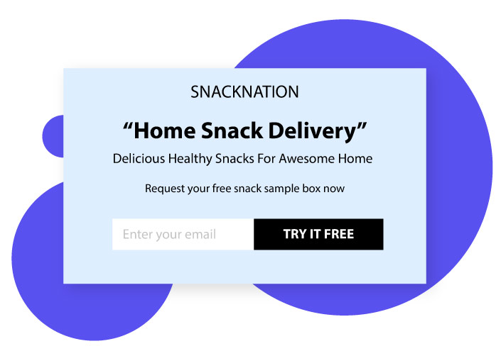
Lead forms that provide options get visitors to click on something and personalize their customer journey themselves. Here is an example from SnackNation, a healthy snack delivery service in America.
It includes two options “office snack delivery” and “home snack delivery”. This helps identify the type of lead so that they can be shown more personalized questions based on their need.
Further, the limitation of the number of options to two allows easier completion and eliminates the need for a “submit” button.
9. Keep it simple
Your visitors would find it easy to give their details when the form is short and simple enough. For this would mean that they need not put in much time and effort into filling it.
In case you need to collect more information from them, do break your long-form into a multi-step form, and do include custom placeholder text (or watermark text).
Placer text appears within your form fields but automatically disappears when the user types their own answers.
It is there to provide users with examples of answers and the way those should be formatted. The below-given image is an instance from Yumi, a site for baby food delivery.
10. Include a confirmation checkbox
Firms that collect email ids from their visitors to send them their marketing emails, usually confirm their consent to receive emails via sending them an email asking for it.
A better idea would be to include a confirmation checkbox in their lead form. This would ensure that you receive only qualified leads and hence get better conversions.
11. Include social proof

Adding social proof to your lead form attracts and motivates your visitors to fill it up. This is because human nature assumes that if a majority of people follow something, it is probably the correct behavior. So, do include social proof.
It can be testimonials or case studies of your existing customers. Or it can be a few words about you from credible experts in your industry or celebrities. Or it can be a certification or accreditation.
Look at the following image which includes multiple social proofs. It says that the person built one of the most popular YouTube channels, and also that several popular magazines have featured him.
These make him an instantly accepted figure, who has a command in his niche.
12. Include an image
Images are always more attractive than mere texts. They pull the visitor’s focus toward them initially, and then to the text nearby. Just makes sure that your image stands out yet matches the theme of the entire site.
Look at the below-given lead form by Marie Forleo, an American entrepreneur known for her best-selling advice books.
See how minimalistic the design is, and ask just for the name and email address, without overwhelming the visitors to part with a load of info about them.
The copy also is well-thought-of and well-written to earn the trust of the visitors.
Positioning your lead form
Now that you have got some wonderful inspirations on what works when it comes to lead forms, you also need to know something about its positioning.
Conclusion
A lead form placed above the fold in your landing page gets better visibility and hence converts better. “Above the Fold” means the upper half of a webpage.
This is the area that initiates engagement while the area below builds on the engagement thus brought about. Positioning your form here will maximize its exposure to prospects and thus help capture leads.
Lead nurturing significantly increases your sales. Lead generation form is great at converting your visitors into leads. There are different tactics employed for creating lead forms that your visitors find difficult to resist.
Some of these include offering value, including your privacy policy link, offering a freebie, having a strong CTA, keeping it simple, including social proof, providing options, including a confirmation checkbox, incorporating adequate white space, and adding an image.
Do try implementing the ideas discussed by us in this blog to find success through your lead forms.
Also Read:

