Why Design Consistency Matters in Every Stage of the Customer Journey
When you think of a brand you love, what comes to mind first? Maybe a color. A shape. A certain tone that feels familiar. That’s not an accident. It’s the result of design that stays consistent. It’s what turns random interactions into something that feels connected.
Design consistency might not sound exciting, but it’s the glue that holds a brand together. Every font, sign, or color choice tells a small part of the story. When those details line up, they build trust without saying a word.
The First Impression That Sticks
The customer journey often begins before anyone even walks in. It might start with a glance at a logo, a storefront, or a quick scroll online. That first look shapes what people expect next.
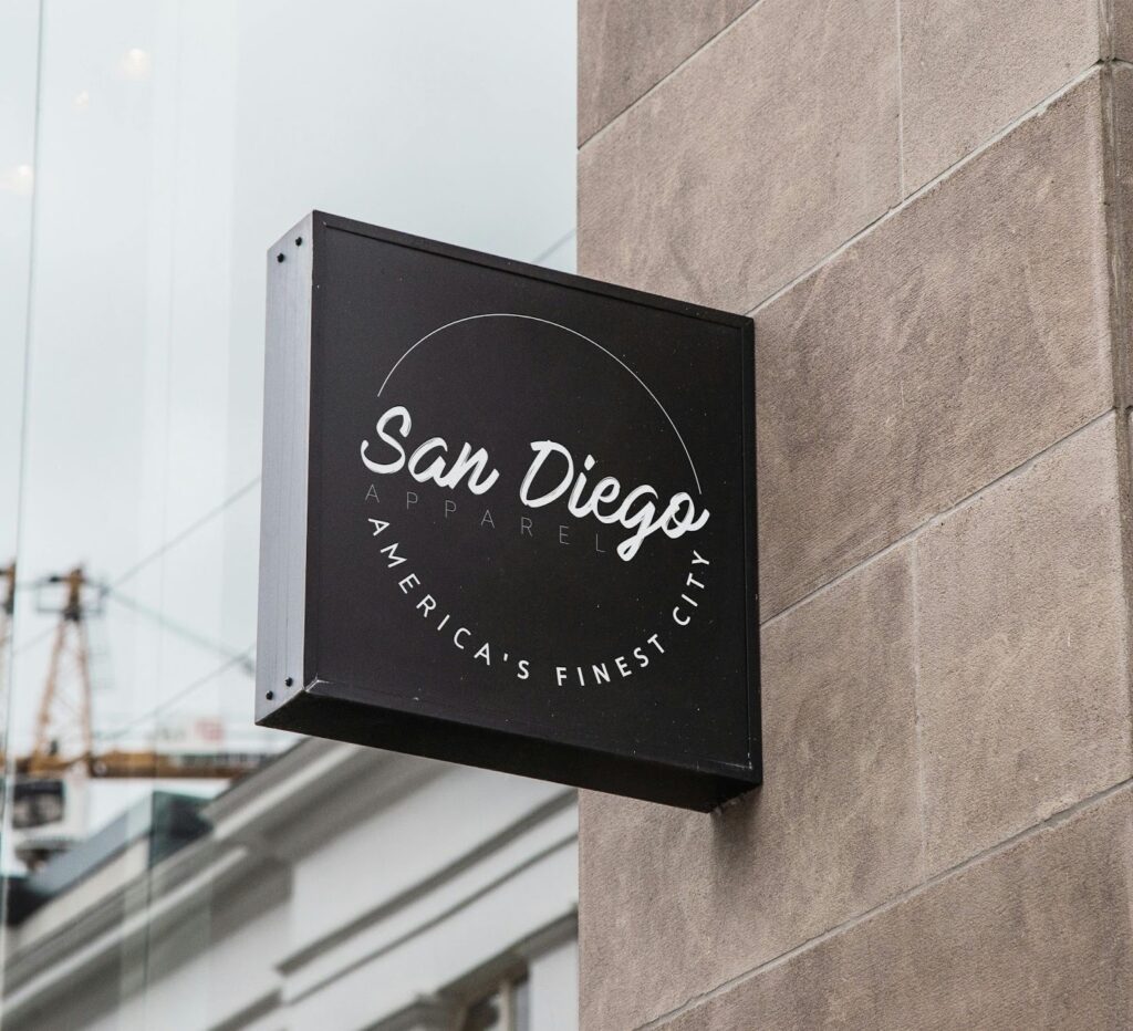
Something as simple as a custom sign for business working hours can set the tone. If it fits the rest of the brand’s look, it feels right. If it doesn’t, people notice. They might not say it out loud, but they feel it. The brain picks up on mismatched visuals faster than we think.
That’s why every small detail counts. A sign, a font, even a background color—these things shape the customer’s first impression. And once that impression sticks, it’s hard to change.
The Feeling of Familiarity
People trust what feels familiar. That’s why design consistency works so well. It gives customers a sense of comfort, like they already know what’s coming next.
When a website and a physical store share the same tone, everything feels aligned. You walk in and it’s like stepping inside the online version. The same calm colors. The same sense of order. That consistency tells you the brand knows who it is.
It’s not about making everything look identical. It’s about giving it a heartbeat that feels the same everywhere.
Emotions Behind the Design
Design is emotional. It doesn’t just decorate a space. It sets a mood. A friendly layout can make people feel welcome. Clean, simple shapes can feel professional.
When brands repeat these emotional cues, they build trust without needing to say much. The customer might not realize why they feel comfortable. They just do. That’s the quiet magic of consistent design—it builds emotion through repetition.
Guiding People Without Words
A consistent design is like a map. It guides people through the journey without using instructions. From the first ad to the store counter, it helps them move naturally from one step to another.
If the design changes too much, people get lost. They might wonder if they’re dealing with the same brand. When things feel off, the experience breaks. But when everything lines up, the transition feels smooth and easy.
That kind of flow doesn’t just happen. It takes intention. It means paying attention to how colors, shapes, and language connect from start to finish.
After the Purchase
The journey doesn’t end at checkout. Brands that stay consistent after the sale stand out. A small thank-you card with the same design tone as the website adds warmth. So does packaging that feels like part of the same world.
When the follow-up emails, delivery boxes, and signage match, it shows effort. Customers notice even when brands think they don’t. It’s those little touches that keep people coming back.
Design consistency is also a sign of care. It says, “We didn’t stop paying attention once we got your money.” That kind of message builds loyalty faster than any ad.
Evolving Without Losing Shape
Design doesn’t stay frozen. Brands change. They refresh logos, adjust colors, or update their look. That’s normal. But the heart of the design should stay the same.
You can modernize without losing identity. Think of it like growing older—you look a bit different, but you’re still you. The trick is keeping that same tone people fell in love with at the start.
When design evolves carefully, it shows maturity. When it changes too fast, people lose connection. The goal is to stay familiar, even when new trends come around.
Keeping the Story Aligned
Today, most customers experience brands in multiple ways. They see them on screens, in emails, and out in the real world. Each place should tell the same story.
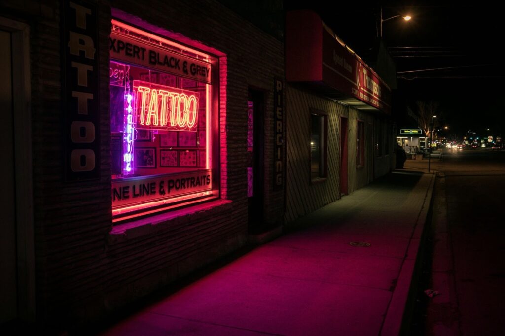
When the tone and look match across every space, it feels like one continuous experience. The same logo colors that appear online should appear on packaging or window displays. Even indoor business signs, wall art, and menus should match that tone. That’s how people know they’re in the right place.
Design consistency turns these touchpoints into a full story. It makes customers feel that everything is connected. That story becomes part of how they remember the brand.
The Power of Repetition
Repetition might sound boring, but it’s the secret to recognition. When customers see the same design elements again and again, they remember them. That memory builds a bond.
Over time, that bond becomes loyalty. Customers know the brand. They trust it. They might not remember every ad, but they’ll recognize the feeling. That’s what consistency creates—a memory, not just a design.
Design consistency isn’t just a rule. It’s a rhythm. It helps a brand feel like itself through every touchpoint. From a custom sign for business working hours to the digital checkout page, each piece should connect naturally.
When that happens, customers don’t just see a logo. They feel a story. They sense reliability. They remember the experience. That’s what turns design from decoration into something that truly shapes the customer journey.