How I Designed a Logo Using the Golden Ratio (And Why It Changed My View on Branding)
I never considered myself a designer. I’m more of a practical thinker — the kind of person who opens a new business idea in a Google Doc, not a sketchbook.
But I’d always heard about the golden ratio being used in famous logos. Apple. Pepsi. Even Instagram. I thought it was just a buzzword. Then one night, I watched a YouTube video titled “How to design a logo with the golden ratio.” Thirty minutes later, I was sketching circles in Illustrator like I was Da Vinci.
Okay, maybe not quite Da Vinci. But that video opened my eyes.
What struck me was how calm and precise the process looked. The designer wasn’t guessing. He used math, proportion, and logic to place every curve and angle. It made me realize: design isn’t just creativity — it’s also structure. And maybe, just maybe, I could do it too.
How I Built My First Logo Using the Golden Ratio
I opened Illustrator the next morning with a mix of inspiration and self-doubt. I followed the same steps as in the video, pausing and rewinding about 50 times. But here’s how it went.
Starting with Circles and Spirals
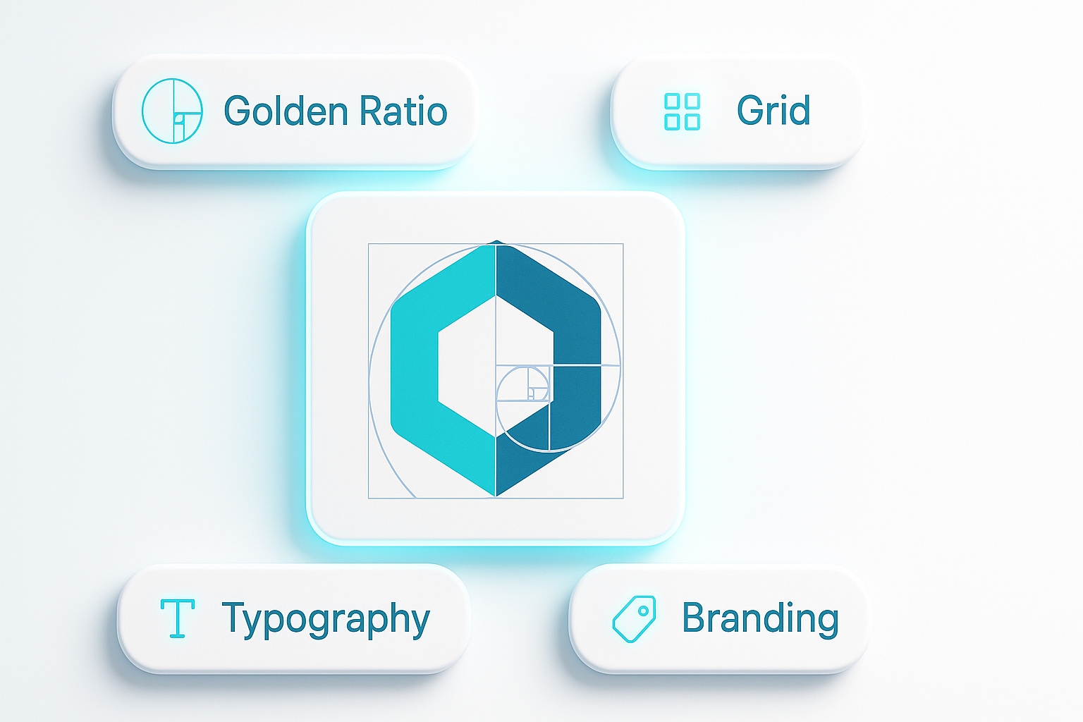
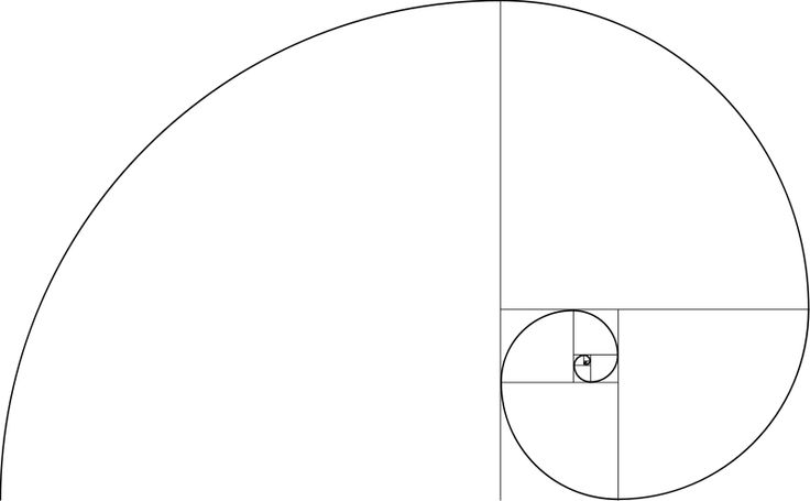
The designer in the video used a golden rectangle as the base. From there, he created a spiral — the Fibonacci spiral — by connecting quarter-circles inside the rectangle. I didn’t even know that was possible in Illustrator. But once I built it, it felt like a blueprint.
Then came the fun part: adding circles of specific sizes to form the logo’s shape. I used the golden ratio to size each one. It felt like solving a visual puzzle. For once, I wasn’t just dragging shapes randomly — every curve had a purpose.
Combining Form and Meaning
I was designing a logo for a personal project — a brand that mixes nature and minimalism. So I used the spiral to help place a leaf icon and align the text underneath it. Everything just… fit. It felt calm and natural, like nothing was forced.
I never thought I’d say this, but aligning things using mathematical proportions felt almost meditative. It made me slow down and think about every design choice.
Cleaning It All Up
The last part was simplifying. I followed the same idea as in the tutorial — merging overlapping shapes, removing extra points, smoothing paths. What surprised me was how “professional” the final version looked. Not flashy. Just clean. Like it belonged.
What This Taught Me About Branding (and Myself)
You Don’t Need to Be a Designer to Think Like One
I used to think logo design was only for pros. But learning the golden ratio gave me a framework. It helped me make smarter, more balanced choices — not because I “had the eye,” but because I had a method.
Structure Creates Confidence
When I used to design “by feeling,” I second-guessed everything. This time, using geometry gave me confidence. I knew why things looked good — not just that they did.
Perfection Isn’t the Goal, Clarity Is
My first attempt wasn’t perfect. But it was mine, and it made sense. It aligned with my values, my aesthetic, and my message. That was more than enough.
AI Tools Can Be a Great Starting Point
Before diving into golden ratios, I had actually played around with a few AI logo maker tools. One I liked in particular was Turbologo — it gave me quick drafts and layouts that helped clarify what I wanted. That made the jump into Illustrator feel less scary. It was like sketching in digital form first, then refining manually.
Would I Use the Golden Ratio Again?
Absolutely. Not because it’s trendy or smart-sounding, but because it works. It slows you down in the right way. It helps you see what you’re doing, not just feel it.
If you’re just getting started with design or building a brand from scratch, I highly recommend experimenting with it. Watch a video, open Illustrator or a free vector tool, and play with circles and spirals. You don’t need to show anyone. Just see what happens.
That video changed how I think about logos, and honestly — it made me feel like I finally had control over my own brand’s look. And that’s a good feeling to have when you’re building something from the ground up.
For more inspiration, check out the story behind the Chanel logo, which perfectly illustrates how simplicity and meaning can shape a timeless brand identity.