


 Email
Email SMS
SMS Whatsapp
 Web Push
 App Push
 Popups
 Channel A/B Testing
  Control groups Analysis
 Frequency Capping
 Funnel Analysis
 Cohort Analysis
 RFM Analysis
 Signup Forms
 Surveys
 NPS
NPS Landing pages personalization
  Website A/B Testing
  PWA/TWA
 Heatmaps
 Session Recording
 Wix
Wix Shopify
 Magento
 Woocommerce
 eCommerce D2C
  Mutual Funds
 Insurance
 Lending
  Recipes
  Product Updates
 App Marketplace
 Academy
eCommerce businesses are facing heavy competition post the pandemic. One area where they keep improving is user experience (UX). Websites focus on enhancing UX through their category pages, product pages, navigation, and checkout processes. One area that they often neglect is the home page.
However, your eCommerce homepage UX is crucial. For, your homepage is one of the first touchpoints your visitors and prospects have with your brand. And it can have a profound impact on customers’ buying decisions and your bottom line. This makes it vital to optimize your eCommerce homepage for great CX. So, in this blog, we will discuss eCommerce homepage best practices to strengthen user experience.
Contents
What are the elements that affect eCommerce Homepage User Experience?
UX refers to how a customer feels about the interactions they have with your brand, website, company values, team, and product/services. eCommerce homepage UX refers to how visitors feel when they engage with your e-store’s homepage.
Your eCommerce homepage serves in performing different tasks for users. It helps them know more about you, find and purchase products, get your customer service contact details, create their account with you, access their wish list and shopping cart, and more.
The key elements and features on an eCommerce homepage are
- Top Navigation Bar: This lists and links to the different departments or product categories in your e-store. You can find menus like home improvement, clothing, and accessories, food and beverage, etc. on the top navigation bar. It also has elements like login, shopping cart, etc.
- Visible Search bar: This lets your visitors directly search your e-store to find the items they are looking for. Some research shows that users who use site searches are more likely to buy as they reach your site with the intention of buying a particular item.
- Shopping cart link: Another vital element of an eCommerce homepage is a link to the user’s shopping cart. It acts as a reminder highlighting the items that he/she has already added to the cart. It is also good to have the user’s wishlist close by.
- Offer bar: This section highlights current promotions. It also contains key info that has an influence on the user’s buying decision. This can be about free delivery, hassle-free returns policy, low pricing, etc.
- USP Bar: USP is abbreviated as Unique Selling Proposition or Unique Selling Point. This bar, therefore, exists to tell visitors about your brand’s unique proposition such as ethically sourced products, organic items, handmade products, eco-friendly packaging, etc. This communicates how your brand surpasses your competitors’.
- Main Category Entries: This section displays the most popular categories that shoppers often click on and purchase from. For instance, an e-store dealing with clothing may have its popular sections as “Leggings”, “Custom men’s suits”, “Women’s tops”, “Inner Wear”, etc.
- Seasonal Categories: This displays sections that are apt for the time of the year or events occurring at that time. For instance, an eCommerce store may showcase its festive clothing collections during Diwali, Christmas, Ramjan, etc.
- Content: eCommerce stores that find content playing a vital role in customer acquisition and conversion have a prime place for their blogs and articles on their homepage.
- Services: eCommerce sites that offer membership schemes for delivery and other perks, finance and flexible credit card options, etc. make it a point to display these services across their homepage.
- Contact information: The e-store displays its contact details like customer service phone number, email address, and their working hours either in the top header or footer.
So, the details in these elements and features of an eCommerce homepage are vital for delivering a memorable UX and promoting brand affinity.
6 eCommerce Homepage Best Practices for Great User Experience
1. Increase your eCommerce Homepage’s Loading Speed
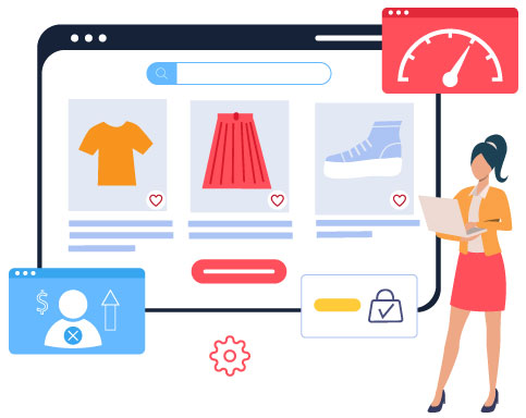
Studies say that internet users wait no more than 3 seconds for the loading of a site to load. One of Google’s research found that bounce rates increase by 106% if the page load time increases from 1 to 6 seconds. So, if you have a slow-loading eCommerce homepage, you’re at the risk of experiencing page abandonment and poor conversions.
So, here are a few best practices to speed up your homepage loading-
- Compress your images: If you have large image files, they’ll slow down your page significantly. So use a compression tool to compress them.
- Minify your HTML: Your HTML can also slow down your homepage’s loading. So, take technical support to shorten the code by deleting redundant and unnecessary characters in it- a process referred to as minification.
- Enable browser caching: This helps in “remembering” those elements and resources (like logos and photos) that load on your site. So, these needn’t be reloaded each time. So, your site tends to load faster.
2. Employ a mobile-first approach
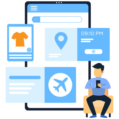
A study says that there are 6.648 billion smartphone users in the world today. This accounts for 83.72% of the world’s population owning a smartphone. They use it to make online searches and perform eCommerce transactions like booking tickets, paying bills, and shopping. This makes it indispensable for eCommerce sites to adhere to a mobile-first approach in web development.
A “mobile-first approach” means that you initially design your website for mobile device screens and later on work up towards larger devices. So, employ a responsive design. It would facilitate the on-site elements to automatically rearrange and adjust themselves to suit the device’s screen they’re viewed on. Many eCommerce Developers help brands achieve this effectively. So, visitors will be able to view and interact with items on your site without resizing, zooming, scrolling, or panning. This way, your eCommerce homepage delivers a good UX.
3. Simplify search and navigation
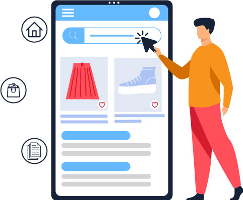
Your shoppers should find it difficult to navigate your site. So, when designing your homepage, take into account users’ expectations and what they’ll be looking for in it. Eliminate extra steps and unnecessary clicks in finding the content they’re searching for. Here are some best practices to employ the best UX.
- Design elements: Ensure that your design elements (search bar, menu, toolbar, etc.) and their placement are logical and intuitive.
- Search bar positioning: Position your search bar at the top of your eCommerce homepage to enable customers to easily search and navigate between different content, products, promos, categories, and more.
- Structure of elements: Structure different elements in such a way that users are able to navigate between those effortlessly and enjoy a smooth user journey.
- Page space: Use a horizontal navigation menu on desktop devices and vertical navigation via a hamburger menu for mobile devices. This will promote usability.
- Menu item priority: Usually, the top and leftmost menu items carry the most weightage due to their visual dominance. Use this info to arrange your menu items in their order of priority.
- Footer: The footer on the eCommerce homepage usually contains links to the privacy policy, email signups, push notification opt-ins, etc. Consider including links to popular category pages too in the footer so that users who’ve scrolled to the page’s bottom can easily access additional areas on your site.
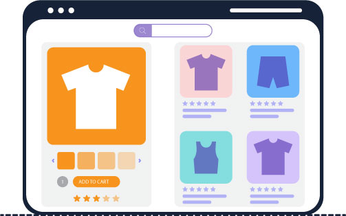
4. Focus on the aesthetics
Providing competitive pricing of products isn’t just enough for eCommerce sites to beat the competition. Aesthetics are as important too. A study found that 38% of visitors leave a site if they find the layout unappealing. Though this holds true for your entire site, take great care in making your homepage look pleasing as it’s the foremost thing your visitor will come across.
So, while designing your e-store, take care that you strike a balance between aesthetics and functionality. Here are some practical tips to enable this-
- Images: Your imagery should be consistent with the brand and relatable to the user. Use high-quality images that are sharp, visually appealing, and, if necessary, unpixelate images to ensure clarity and professionalism. They should focus on creating an emotional association.
- Colors: Use pleasing colors and color combinations that go well with each other to set the tone of your eCommerce homepage.
- Copy: Choose from a variety of tones such as humorous, professional, friendly, empathetic, surprising, etc. based on your target audience.
It is one of the Ecommerce homepage best practices, so make sure you use this one.
5. Maximize the space above the fold
In website design, the term “above-the-fold” refers to the part of a web page that is visible to the viewer without scrolling. And the other part that can be viewed only by scrolling down is referred to as “below the fold”. Simplify things for your customers and prospects by placing the info, links, and call-to-action they’ll be looking for above the fold.
When it comes to viewing your site on smartphones, this concept isn’t applicable. But it applies to other mobile devices and desktops. However, as there’ll be varied screen sizes and resolutions, it can be tricky to determine the location of the fold line. When you determine it, maximize the space above the fold by keeping the most important, the most engaging, and the most relevant of your homepage there.
6. Collect direct and indirect feedback

Although you get valuable insights into how you can improve customer user experience, it is also good to ask your audience about it directly. So, launch a web survey to get the voice of your customers. And use this as a guide to optimizing your design accurately for their needs. You can deliver your survey right on the homepage to get a quick and apt response without being intrusive.
Also, collect indirect feedback on re-designing your site by getting to know about your customers’ web experience. You can do this via interactions and mentions of social media networks and unsolicited emails received by your brand. Though some of them may be negative, they’d still serve as useful resources to continually enhance the UX of your eCommerce homepage, product page, check-out experience, and more.
So, here are the 6 ecommerce homepage best practices that will help you deliver a great user experience.
Conclusion
When shoppers get to your eCommerce homepage, they seek to find relevant info about the product they want to purchase. They also expect a fast and hassle-free online transaction. By meeting and exceeding these expectations and avoiding eCommerce marketing mistakes, you can ensure a great user experience. So, make use of the five Ecommerce homepage best practices we’ve discussed in our blog.

