


 Email
Email SMS
SMS Whatsapp
 Web Push
 App Push
 Popups
 Channel A/B Testing
  Control groups Analysis
 Frequency Capping
 Funnel Analysis
 Cohort Analysis
 RFM Analysis
 Signup Forms
 Surveys
 NPS
NPS Landing pages personalization
  Website A/B Testing
  PWA/TWA
 Heatmaps
 Session Recording
 Wix
Wix Shopify
 Magento
 Woocommerce
 eCommerce D2C
  Mutual Funds
 Insurance
 Lending
  Recipes
  Product Updates
 App Marketplace
 Academy
Landing pages are an excellent way to enhance conversions and earn more from your paid ads to maximize ROI. But if you do not optimize your landing pages, you could be missing out on valuable ways to build landing pages that can assist you in attaining your marketing goals.
There, today, we will be looking at what landing page optimization is, some of the best practices, and the best tool to employ.
So, first things first, let’s start with the basics and then move on to the practices and then tools.
Contents
What is Landing Page Optimization?
The idea behind landing page optimization is to enhance landing page performance. You can do optimization by improving the design, layout, navigation messaging, and images on your landing page. In addition, you can utilize data about your visitors and consumers to understand their behavior in a better way.
Landing page optimization further ensures that you receive a good return on investment on your pay-per-click campaigns. When your landing pages are optimized and customized as per Facebook Ads or ads from any other platform, then it will lead to a reduction in the acquisition cost per lead.
14 Landing Page Optimization Best Practices to Boost Conversion
1. Make Your Offer Clear
This is one of the most important things that you need to keep in mind that your offer should be clear to the customer. Don’t use vague words—tell them directly what your brand is offering and how they can get it.
Since you have made efforts and set a goal for your landing page, then make sure it shouldn’t be complicated to discuss your offer, the perks it brings to your landing page visitors, and how they can leverage your offer.
2. Keep It Simple
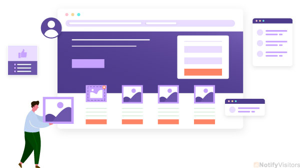
Some marketers have this notion that they need to add numerous different elements to their landing pages to build interest, but that’s not true; in fact, it is counterproductive.
Make sure that your landing page focuses on a single goal. Each element on that landing page should drive your visitors towards conversion if you incorporate too many things that dilute your message and distract your visitors.
You don’t need to add dozens of images or miles of copy to share your message. Instead, you need to choose elements for the top of the page to grab visitors’ attention and apply just enough copy to spread your message.
3. Try contrasting colors
The best landing pages we have come across, use contrast but in color and clarity. For instance, Starbucks, Their “Join Now” button reflects the star’s color in the left-side logo, and it is pronounced and clear.
In addition, applying the black background makes the headline and CTA pop. Further, there is negative space between the logo and the rest of the elements.
4. Using Scarcity Tactics
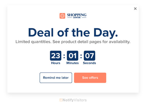
Scarcity tactics are prevalent in landing pages; therefore, you need to take a moment to make sure that you’re doing it accurately.
First, it’s crucial to understand that you don’t require scarcity tactics; even some marketers dislike them.
However, if you have a limited time or limited supply offer, a well-placed scarcity method will encourage your visitors to work before they miss out.
It can assist you in front-loading your sales and getting those ready to convert right away.
We recommend utilizing scarcity tactics while dealing with truly limited time or quantity offers when it comes to scarcity tactics.
However, utilizing this method too frequently can turn off visitors or even make you miss out on sales because everything appears to be in a sale.
5. Keep the relevant part above the fold
As we all have seen, the most enticing stories are always placed on the first page above the traditional newspaper fold so readers would understand the headlines and purchase the paper.
Simultaneously, you can apply the same rule for landing pages by putting the elements above the digital fold — the point at which the user needs to scroll to know more information.
However, this is more complicated than ever now that more people are utilizing smartphones and tablets.
The best part is that you can apply a scroll map to quickly recognize the location of the average fold on several devices and still put your headline, CTA front and center, and a brief sentence or two of body copy.
6. Keep your call-to-action buttons straightforward

While using this landing page optimization, make sure that your call-to-action button doesn’t stress out or mislead the reader. Make your offer precise, concise, and obvious.
You’ll see that companies stay away from intricate language or complex offers while using it. You can use phrases involve:
- Join to Download
- Try Dropbox Business Free
- Join Now
- Pick Up Here
7. Add contact information

You can administer your website visitors with contact information in different ways. For instance, you can place your phone number or email address on your landing page or utilize a contact form.
Other companies, such as Shopify, incorporate links to their aid centres.
Customers understand by now that they can get contact information, answers to frequently asked questions, and tutorials in help centres.
8. Try different headlines and copy
The text still has relevance in this image- and video-focused era. People will see what you write, so ensure it goes with your target audience.
Make use of A/B testing and test different headlines on your landing page. You can also shape up the copy body and run A/B tests to understand how those elements perform.
9. Be consistent
While on-brand messaging matters more than ever, visual consistency can also make a vast difference in conversion rates.
For instance, you put a Facebook Ad that drives people to your landing page. So, naturally, you want your ad’s text, imagery, and other elements to get reflected on the landing page.
Therefore, you have to ensure that they should look visually similar and allow the same offer. Otherwise, your potential customer will be frustrated or irritated.
10. Add testimonials to convert undecided users further
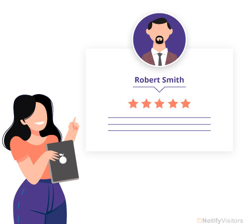
Social proof is a psychological aspect in which people consider other’s behavior as a guide for their own behavior.
Essentially, it indicates that visitors to your landing pages will perceive social proof in the form of reviews and testimonials, lists of well-known clients, and more.
Further, they will be more prone to convert because they can comprehend that you have other satisfied customers just like them.
Social proof doesn’t just incorporate information given by other customers but can also include things like trust badges, credentials, guarantees, and a lot more.
11. Try different form lengths
Some marketers think that only concise forms work well, but it’s not always true.
A longer form can be more helpful to qualify leads for an expensive product or service. As a result, you might see fewer leads, but those leads will be more qualified.
For example, questioning the potential customer’s budget for a web design business can save you tons of energy and time. A customer looking for a $500 plan probably won’t use your service if your minimum package begins at $20,000.
12. Optimize your landing page for SEO
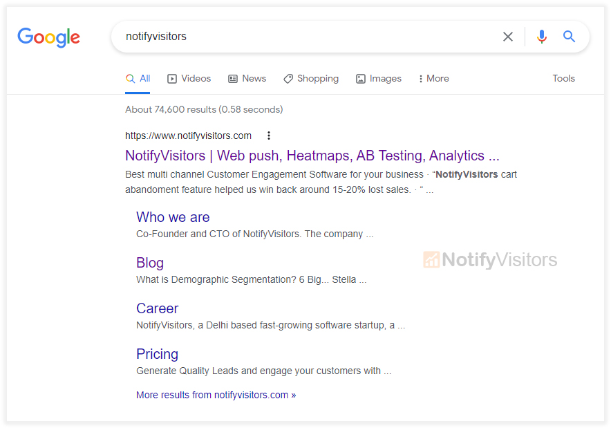
People discover landing pages through organic search all the time. So it might be possible that one of your landing pages is your home page; further, you can also get ranked for industry-related keywords.
Utilize tools like Ubersuggest to discover the best keywords for your landing page. Then, include those keywords into headlines, body text, image alt text, and more.
13. Try an exit popup
An exit popup shows on your landing page screen if a visitor tries to leave the page. It’s another chance to create a conversion.
They’re less intrusive than popups that appear as soon as a visitor arrives or simply while they are looking around.
Use a mixture of compelling visual imagery, a powerful headline, and CTA text to get users to click. Try to incentivize the exit popup with a special discount or other offers.
Make sure you use exit popups for individual pages on your site; don’t forget to do A/B test variants. You’ll get massive valuable data and a way to snag visitors who wish to hang around because of your well-timed offer
14. Keep A/B testing everything

Running A/B tests help you get more precise data. Each A/B test should incorporate a single change to one variant, such as your CTA.
If you modify multiple elements, you won’t recognize which one influenced the conversions between the two variants.
After you’ve accumulated data and gotten to understand your audience, you can apply what you saw to a redesign and verify that it enhanced your conversion rate via A/B testing.
What’s the best Landing Page Optimization Tool For You?
NotifyVisitors gives extensive landing page optimization tools to support you in better understanding user behavior.
Heatmaps, for instance, lets you watch mouse movements, clicks, and more to understand what catches their interest, what turns them off, and a lot more.
Wrapping it up
In this post, we have learned the basics of landing page optimization and how you can get more conversions by using some of the common practices, further we have seen what’s the best tool for you.

